
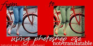
01. Choose your base. This one has lots of reds and blues in it, so this colouring works really well. I didn't lighten it at all... so I just have my original picture, cropped.
02. New selective colour layer:
red;;
c: -100, m: +26, y: +74, b: +100
yellow;;
c: -28, m: +21, y: +46, b: +50
cyan;;
c: -54, m: 0, y: 0, b:0
blue;;
c: -37, m: 0, y: 0, b: 0
neutral;;
c: -8, m: -16, y: -19, b: +5
black;;
c: 0, m: 0, y: 0, b: +27
03. New selective colour layer:
red;;
c: -100, m: 0, y: 0, b: +136
04. My picture wasn't dark enough for me, so I added a levels layer:
Channel: RGB
Input Levels: 0, 0.83, 255
05. New colour balance layer:
midtones;; 0 / +22 / -29
shadows;; +4 / 0 / -21
highlights;; 0 / 0 / +16
06. New colour fill layer with #f1c100 set to soft light 100%.
[This layer may need to be reduced after the next step].
07. Last selective colour layer:
red;;
c: -31, m: 0, y: +19, b: 0
yellow;;
c: -21, m: -22, y: -85, b: 0
black;;
c: 0, m: 0, y: 0, b: +31
08. Put 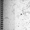 texture on top I rotated it 180 degrees and set it to multiply 100%. I didn't like how all the little flecks reduced the quality of the icon, so I blurred the left part a bit