
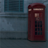
1. My base is really dark and blue.
There are different methods you can use to solve this problem.
THere is auto levels, variations, selective coloring, and many more.
For my base, I used variations and got this: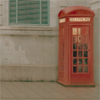
2. Duplicate your base twice
First duplicate is set to screen 100%, second to soft light 100%
(To brighten, and add more contrast)
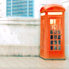
3. I want to get rid of some of the orange, and add some blue,
So add a new color balance layer.
Midtones: -54, -12, +32
Shadows: +30, +25, +19
Preserve Luminosity is checked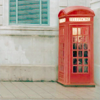
4. It's nice, but a bit dull
I want to make the reds and blues really pop, so I'm going to make
a new Channel Mixer layer
Red Channel: +112, -26, +18
Green Channel: -6, +108, 0
Blue Channel: -42, +44, +104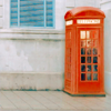
5. It's kind of murky looking, so I added a Brightness/Contrast
layer with the following settings:
Brightness:+23
Contrast: +9
And that's it!